There must be a reason for every element - text, graphic image, and layout of your catalog design. The special thing about creating a catalog or brochure is that it focuses greatly on a particular meaning or message. Sometimes, not even the audience (or the artist) knows the meaning behind why they create their art. Inspiration, drive and the "artist's high" - that state of mind where thoughts nor time exist, only automatic creation and concentrated action. All artist's know this feeling and it is perhaps this feeling that drives artists to continue creating art. But, within this almost hallucinogenic experience of developing art, "meaning" no longer becomes a motive - not really. The meaning behind some art lies in the subconscious of an artist and even the viewer. It is this deciphering of the meaning of a piece of art that makes viewing art so fun.
However, when it comes to catalog prints, meaning is very important. If the catalogs, in some sense, psychologically confuses the viewer and/or doesn't make sense, the message of the catalog could be undecipherable, ignored or worse, thrown away. And so, catalog design artists are one of the very best artists around (in my opinion). It is because not only are they artists with vision, but they have a very specific goal and that is to inform the audience of a very specific message while "entertaining "that audience enough to solidify a place in their audience's memory. It's the psychology of marketing at it's best.
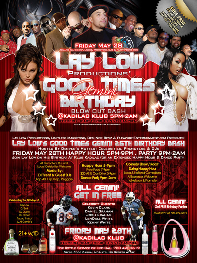
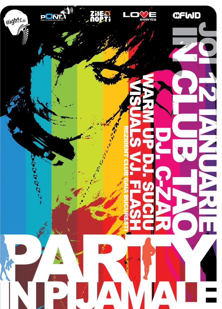
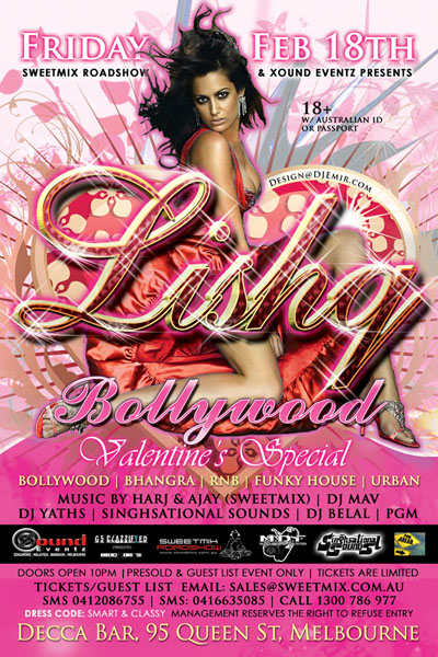
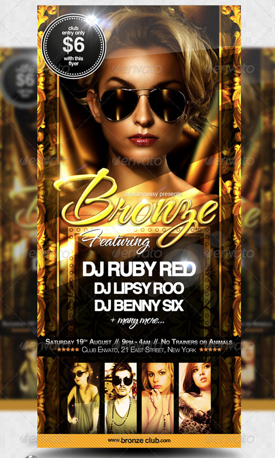
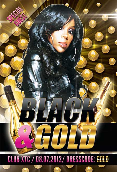
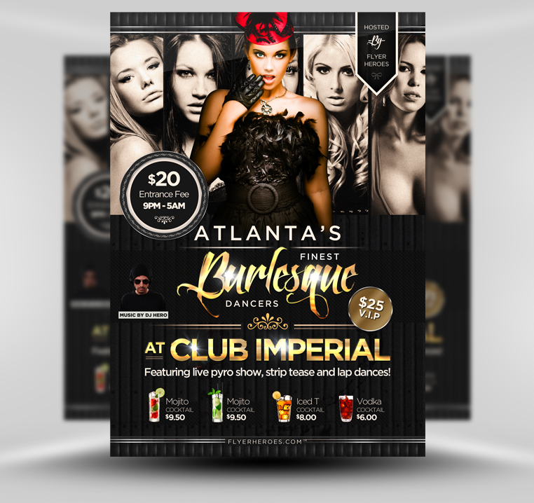
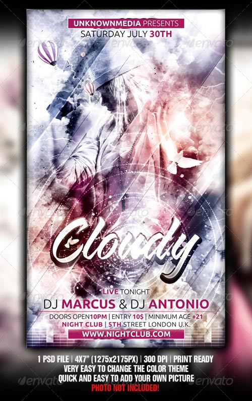
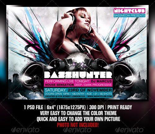
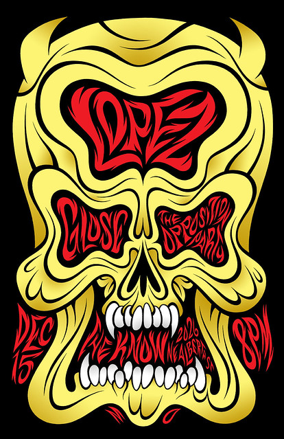
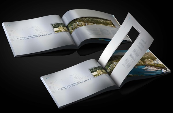
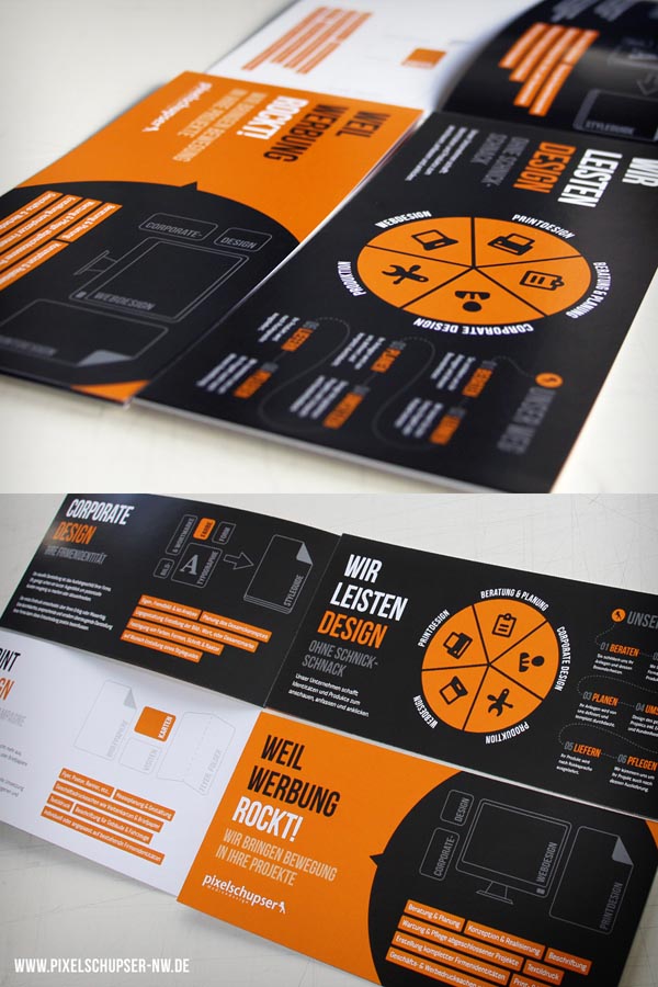
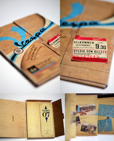
So, here are a few of the best catalog designs that I believe do a great job leaving a lasting impression on the public. Enjoy!

It might be a little pricey to order custom cut catalogs, but is it worth it? From working with a printing company and in the field of marketing for the past 4 years, I have noticed that brilliantly designed powerfully impactful, gorgeously artistic catalog printing designs and even business cards do make an impact. Does this impact convert to sales? Well, sometimes they do.
Businesses spend a lot of time and money branding their name and image. This way, they will be remembered. That's all you really want - your company name to flash in the minds of your potential customers as soon as they think about your product or service. Of course, return customers rest on your sole ability to service your customers well. But, to get them through the door I notice it's discounts, Groupon.com, SEO, and great business cards, flyers and catalogs. Trust me, old school paper advertisement still works.


Make a great first impression and you increase your chances of earning a potential customer. Strange catalog creations such as these make an impression. People will remember your company after fiddling around with a catalog or flyer that physically and mentally engages them.


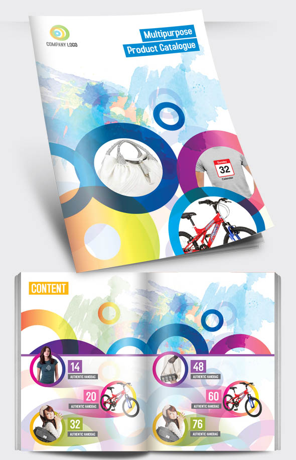
The layout of your catalog is also very important. Graphic artists have a keen eye when it comes to balancing visual elements such as texts, graphics as well as color coordination.


Playful is also good. But, obviously, it depends on your product or service. Try different variations of catalog printing designs to attract different demographics.


- Repetition of particular graphical elements or text
- Balance of graphical elements or text
- Symmetry of graphical elements or text
- Color Coordination

Well, I hope you enjoyed my collection of the most awesome catalog designs I have found on the internet. If you have some art work you want to share or show off, please share links to your work in the comment box.